BAND MERCH
ROBERT JON & THE WRECK — GLASGOW TOUR T-SHIRT (2026)
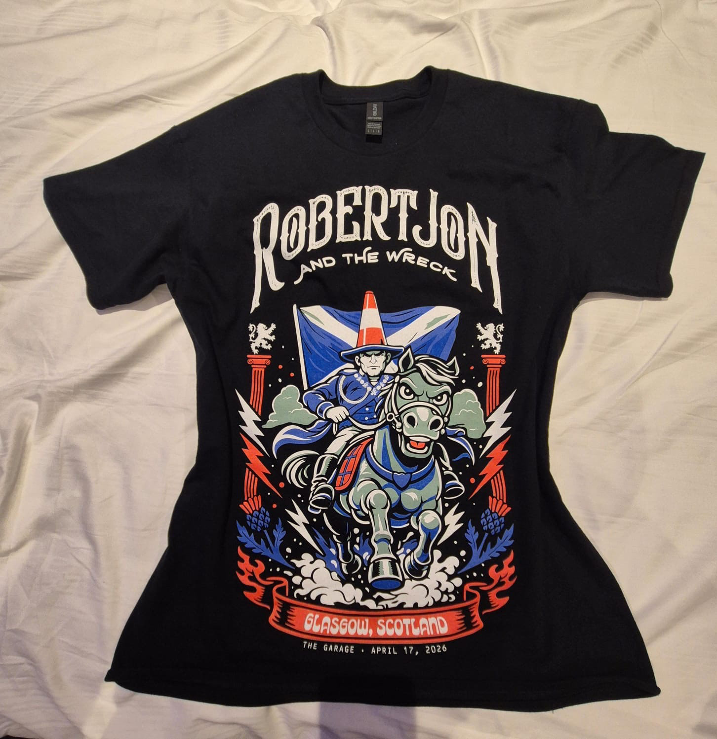
This design started from a simple Instagram story of Glasgow’s Duke of Wellington statue, complete with its iconic traffic cone.
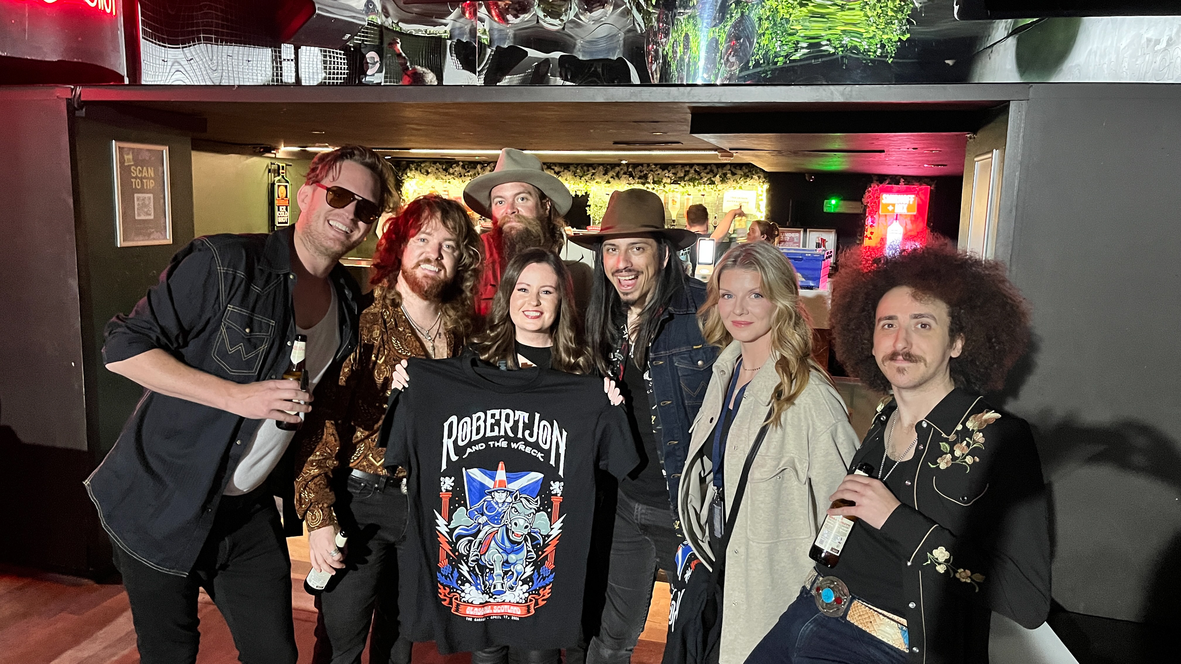
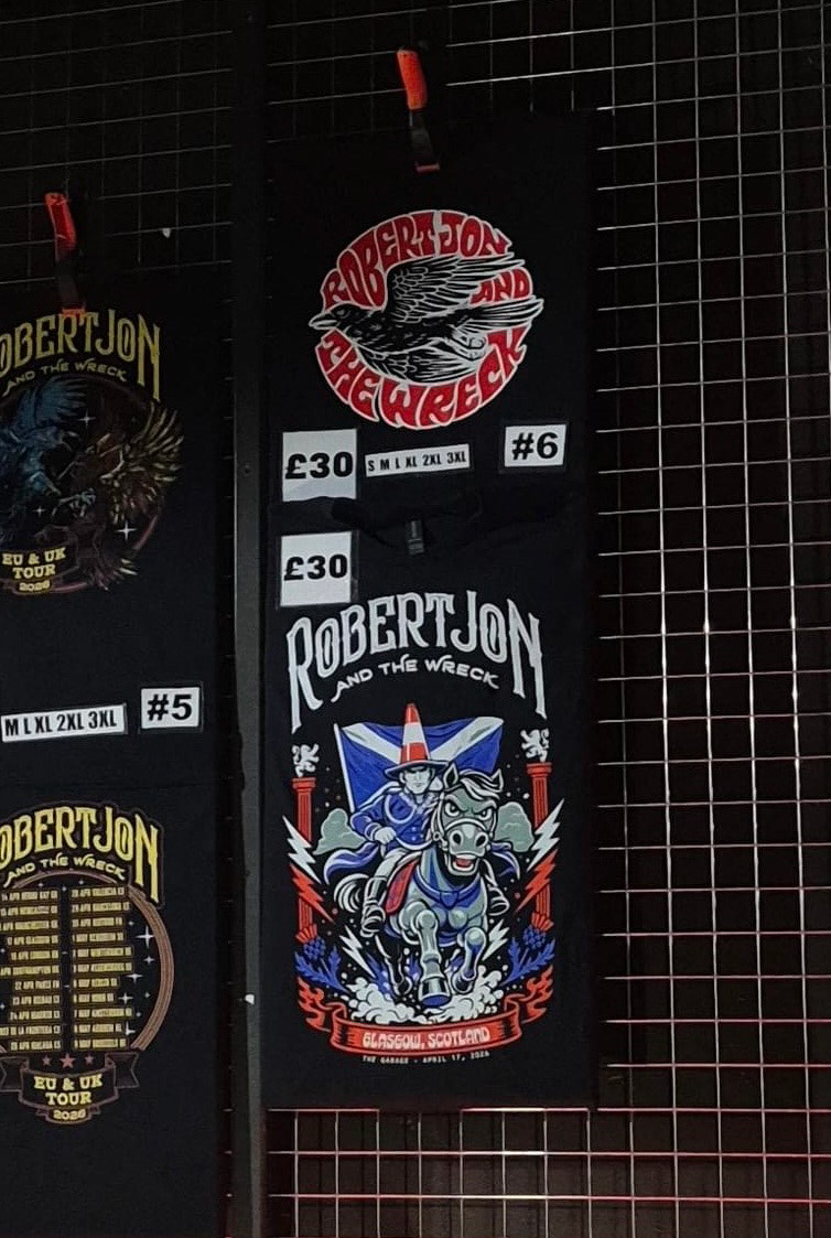
After seeing it, Andrew Espantman (drummer of Robert Jon & The Wreck) got in touch saying the band loved the idea of turning it into a T-shirt. I developed the concept into a bold, cartoon-style illustration, designed with a strong screen print aesthetic for their Glasgow show at The Garage.
The T-shirts proved extremely popular on the night, with multiple sizes selling out before the band even took the stage. There has even been interest from fans in the US trying to get hold of the Glasgow design.
Seeing the artwork printed, worn by fans, and shared in person with the band was a standout moment, and a great example of how quickly an idea can turn into something tangible.
CALLUM BEATTIE — CHARITY ALBUM LAUNCH CARICATURE POSTER (2026)
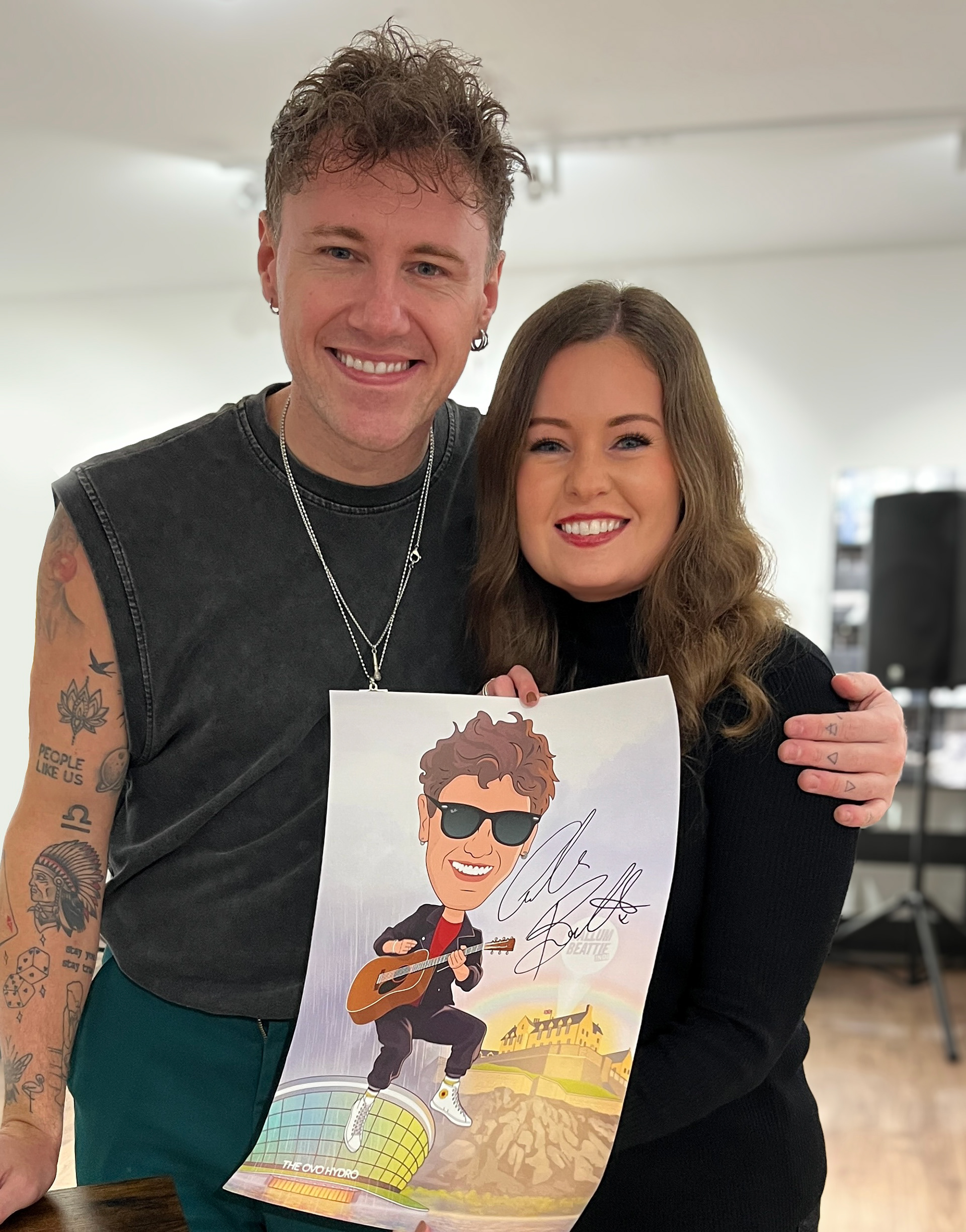
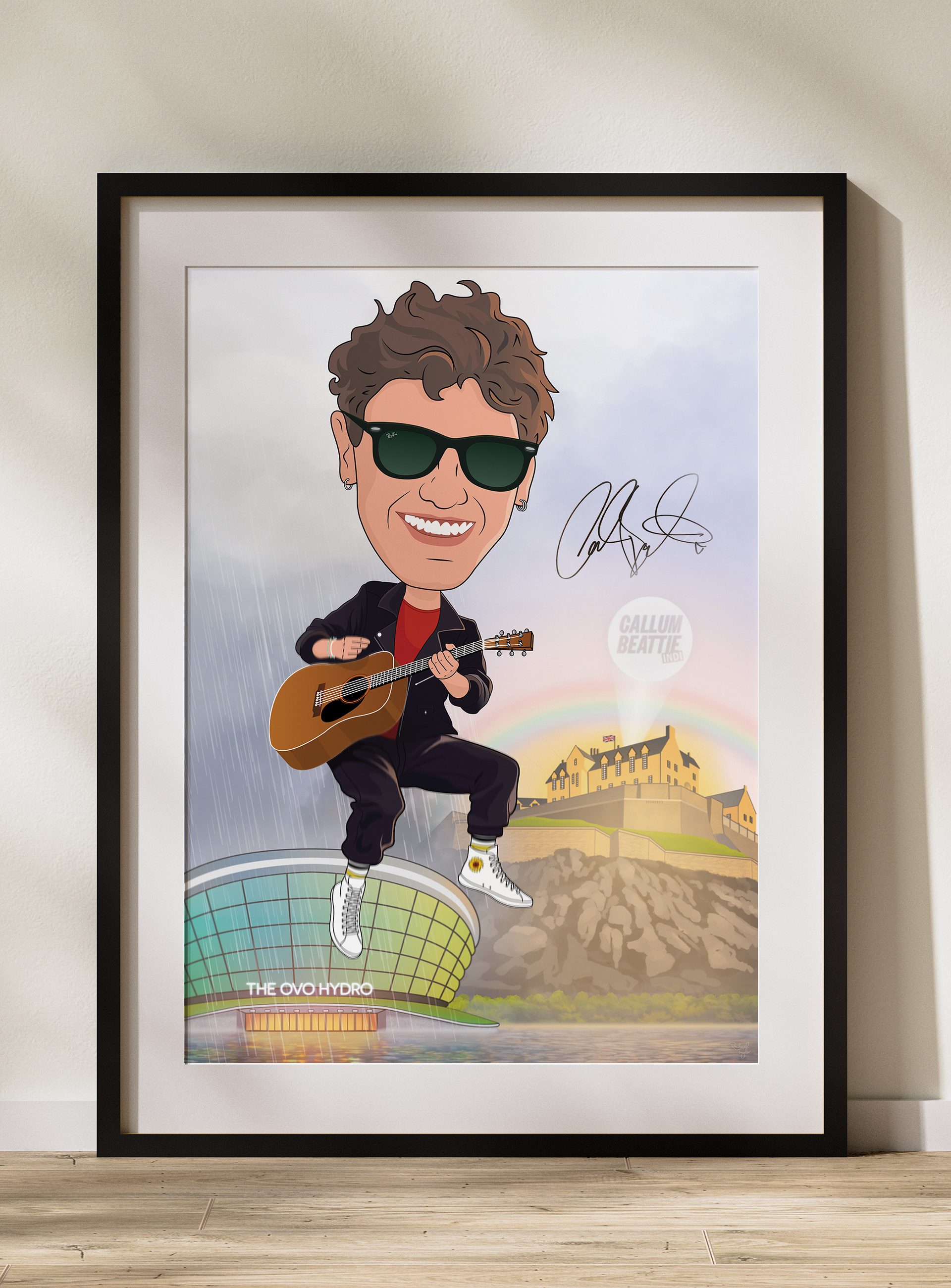
I recently had the pleasure of creating this caricature illustration for Callum Beattie’s charity album launch.
The concept was inspired by his recent sold-out show at the OVO Hydro and his upcoming performance at Edinburgh Castle this summer. The rain in the artwork is a small visual nod to “It Always Rains in Glasgow” from his new INDI album — a subtle detail tying the illustration to his music.
The artwork was produced as a limited run of 50 signed A3 prints to help raise funds for charities close to Callum’s heart. One of the prints was auctioned on the night and raised £500, which was fantastic to hear.
The prints were produced on 170gsm uncoated stock to give a softer, more tactile finish that suited the illustrated style.
It’s always special working on projects where creativity can contribute to something bigger than the artwork itself. I’m always open to illustration and design projects that support charitable causes.
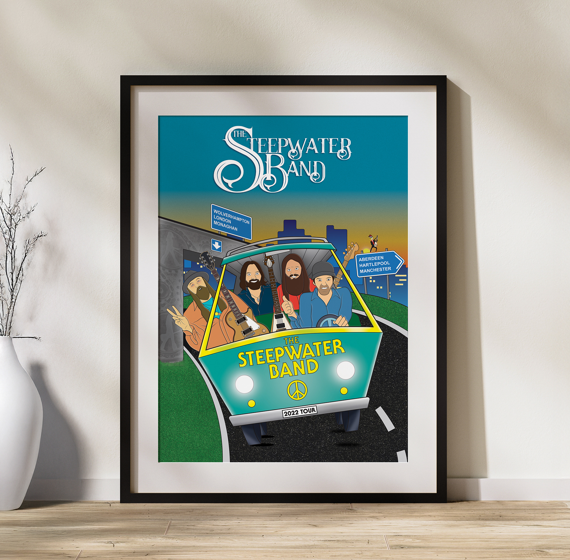
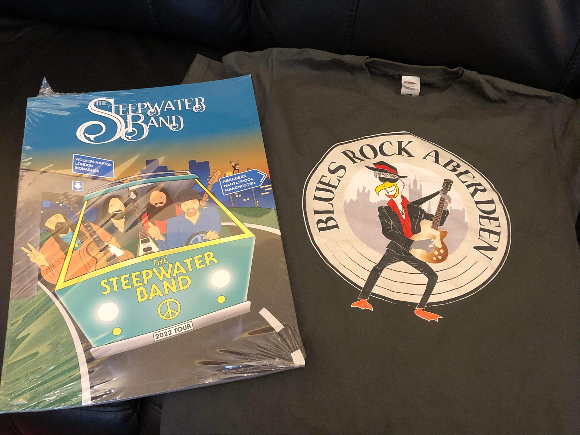
This design was created as a surprise gift for The Steepwater Band, commissioned by the owner of Blues Rock Aberdeen to celebrate the start of their UK tour. The brief was to capture the band’s energy in a fun, cartoon style inspired by classic Scooby-Doo animation. Featuring all four band members and a nod to the UK tour locations, the artwork was printed on posters and T-shirts and sold at gigs throughout the tour.
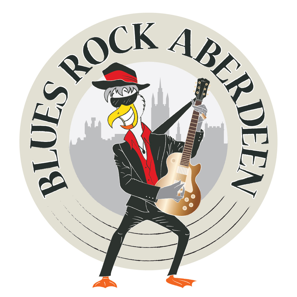
This logo design for Blues Rock Aberdeen was all about attitude and character. The brief called for a cartoon-style seagull—Aberdeen’s unofficial mascot—rocking out on a Gibson guitar, with inspiration drawn from classic Black Crowes album artwork. I built the design around a vinyl record shape, layered with the Aberdeen skyline in the background.
A vintage colour palette gave it a retro gig-poster feel, while bold red accents nodded to Aberdeen’s local identity. The final design was printed on T-shirts and became a standout piece of local merch for the fans at Blues Rock Aberdeen.
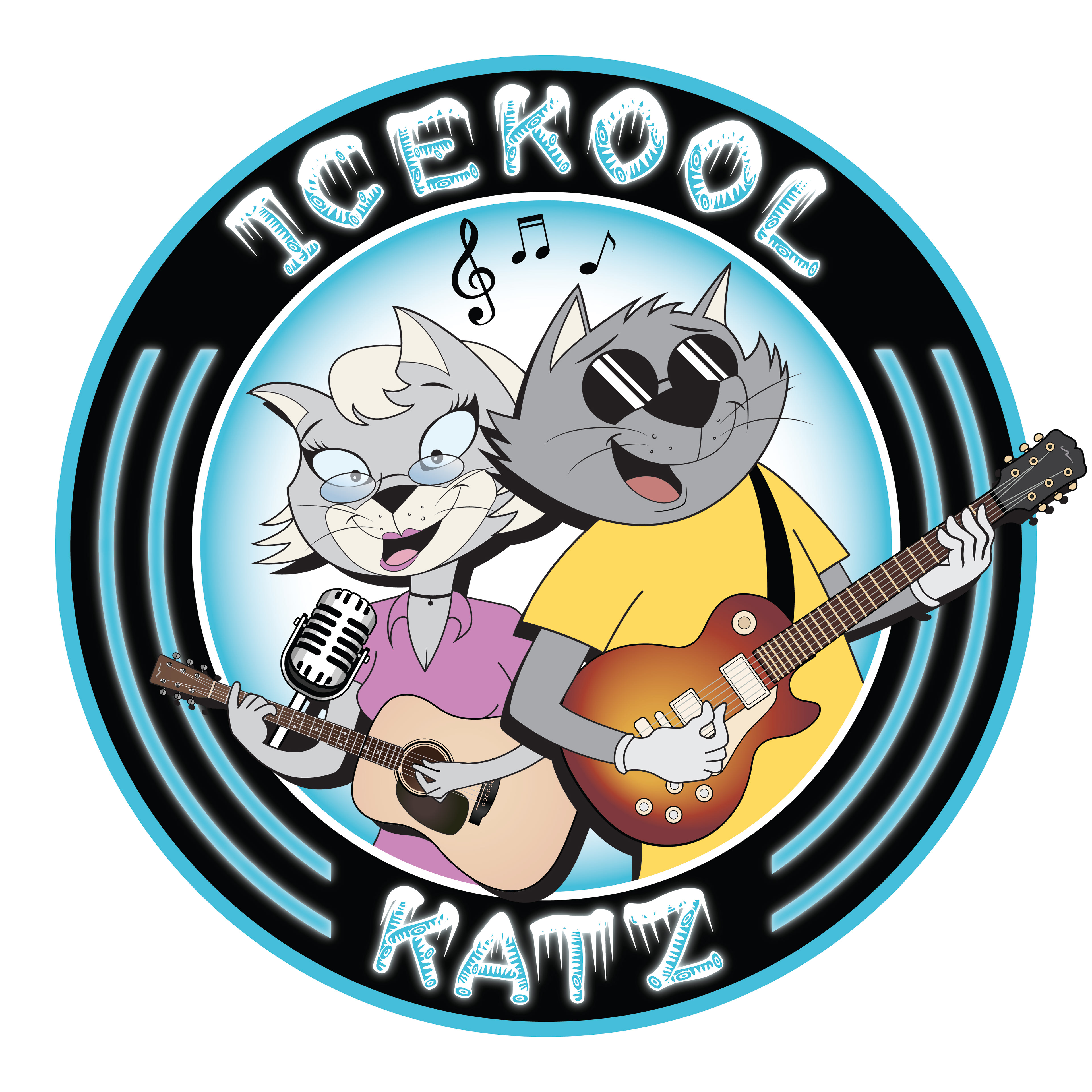
This logo was designed for local band Icekool Katz, who reached out after seeing my previous work for Blues Rock Aberdeen. They loved the bold, cartoon style and wanted something equally eye-catching to represent their band. Inspired by their name and playful energy, I created a custom character-driven logo that captured their vibe—cool, quirky, and made to stand out on posters, merch, and social media.
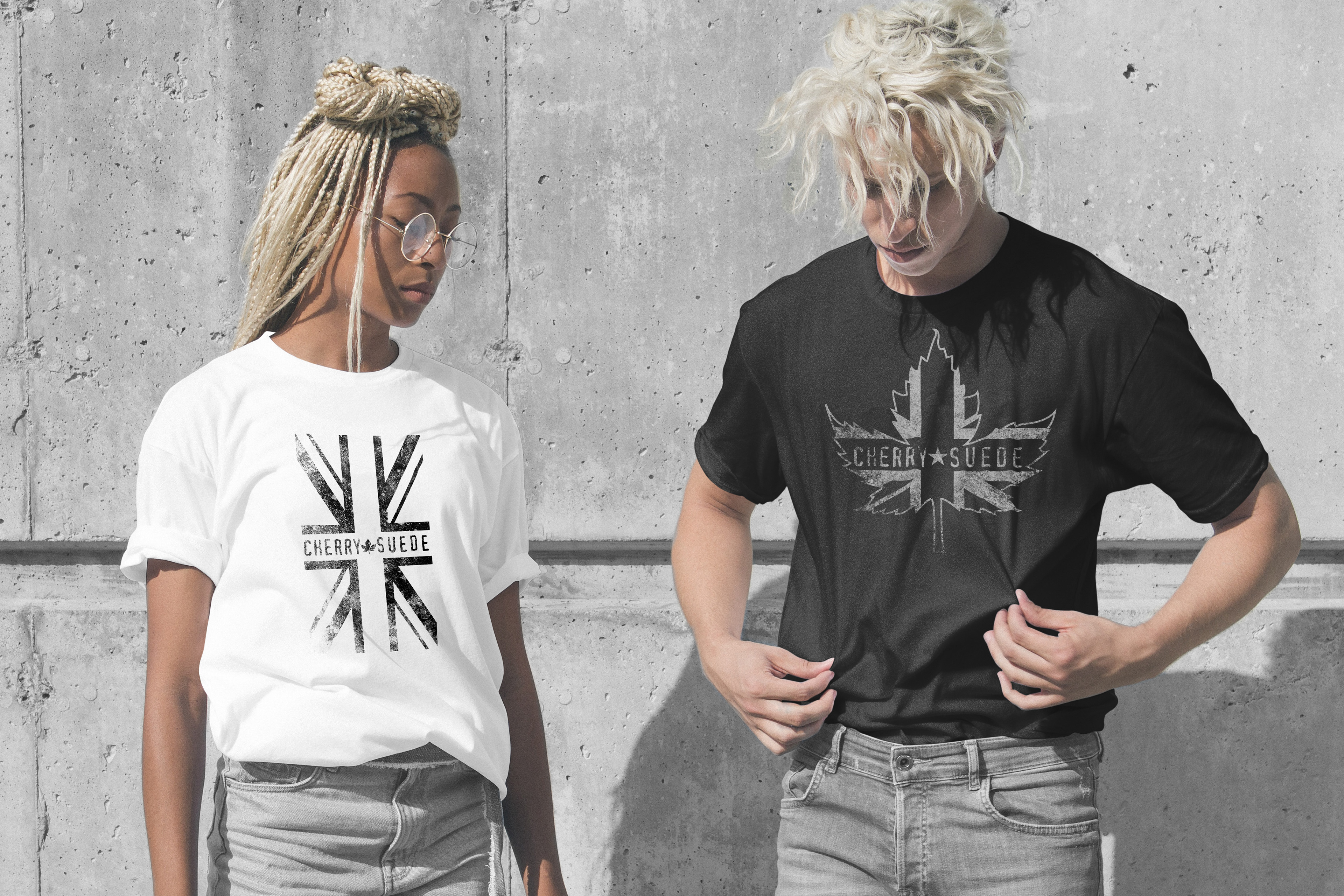
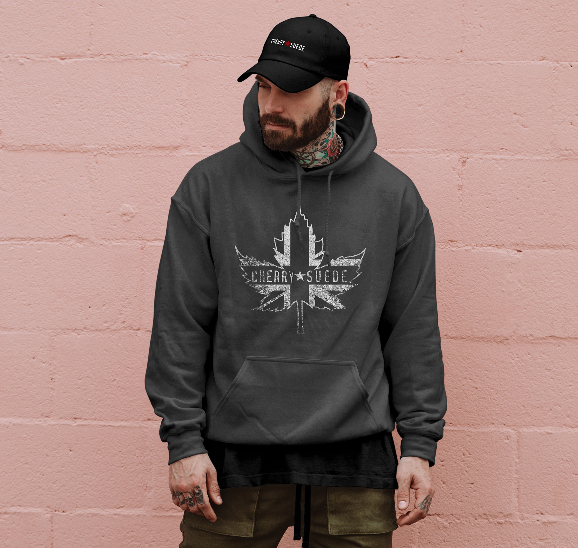
These custom clothing designs were created for Canadian rock band Cherry Suede to celebrate their UK tour. The brief was to combine the UK and Canadian flags into a bold, unified graphic that fans would instantly recognise. The final designs were printed on posters, tank tops, hoodies, and T-shirts, and sold at gigs throughout the tour making them a standout piece of tour merch.
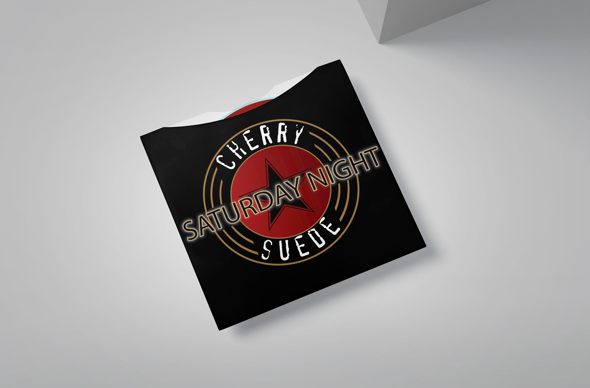
This cover artwork was created for Cherry Suede’s single “Saturday Night”—a fun, high-energy track with a feel-good vibe. The design features a neon-style logo set within a circular record outline, incorporating the band’s signature star emblem. Designed to pop on digital platforms like Spotify, it gave the release a bold, retro-inspired identity that matched the spirit of the song.